 Words will be a lot of pages of words to read. What background
to display these words over has occupied a lot of my time. My first
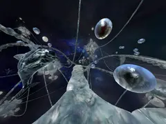
thought was to go for something similar to the inside of the crystal
skull Atlantis 3 but I didn’t the skill or artistry for it,
and it would have have overpowered the text in front.
So my next thought was to generate artificial landscapes in something like Bryce, perhaps in weirdly shaped worlds like something out of Philip José Farmer. I spent time on trying to use Perlin noise to generate height maps. Again such a backdrop would have drowned the foreground text. Thoughts kept coming, about wavering Escher staircases or Margritte apples and umbrellas bobbing around.
 The next serious thought came when I watched a music video for
the Japanese electronica group Perfume.
This video had the camera moving through wireframe buildings -
I thought this might work as a background, it wouldn’t dominate
the foreground. So I wrote Ruby code which extracted lines from
models inside Sketchup, and generated
Javascript code to draw them using the HTML5 canvas.
This managed to draw lines but it wasn’t as delicate as I would like. I had to thicken the lines to avoid pixellation as the lines rotated. It also wasn’t fast enough - even after optimisation it still ate up the CPU on our iMac. So it wouldn’t have worked well on a tablet. Sigh.
 I began looking at Unity as a means of implementing the game,
which would address the performance problem. In so doing I
thought about being very fancy and having as a backdrop and
main screen a scene made up of words moving in 3D. It was at this time
the name of the game changed to Words from Memoriam.
It didn’t take long for me to realise Unity has a steep learning curve, and that Unity wasn’t going to give the sharp precise look I was after. So the latest idea is for the main menu and backdrop to be made up of words, but words moving in 2D rather than 3D.
There’s an self-referential theme on the main menu, so the word “tiny” is in a small point size. “gnu” is a programmer’s joke (as well as a name of a song by Flanders and Swann). “cyan” is in the colour cyan, as well as the name of the company who developed “Myst”.
I hoped to do the animation of the main menu using CSS animations, but had to do a lot in Javascript. Either it wasn’t possible in CSS, or the results were too jerky when I tried.